What is Forex Indicator?
Indicators are Must Know in Forex trading, as it help to know when to buy or sell in the Forex Market. As a result, successful traders must learn that there are a variety of indicators that can help to determine the best time to buy or sell a Forex cross rate. Here are different market indicators that most successful Forex traders rely upon.
There are good numbers of Forex Indicators:
1. Forex Support and Resistance
Support and resistance is one of the most widely used concepts in Forex trading.
Strangely enough, everyone seems to have their own idea on how you should measure Forex support and resistance.
Let’s take a look at the basics first.

Look at the diagram above. As you can see, this zigzag pattern is making its way up (bull market).
When the Forex market moves up and then pulls back, the highest point reached before it pulled back is now resistance. As the market continues up again, the lowest point reached before it started back is now support.
In this way, resistance and support are continually formed as the Forex market oscillates over time. The reverse is true for the downtrend.
Often times you will see a support or resistance level that appears broken, but soon after find out that the market was just testing it. With candlestick charts, these “tests” of support and resistance are usually represented by the candlestick shadows.

Notice how the shadows of the candles tested the 1.4700 support level.
At those times it seemed like the market was “breaking” support.
In hindsight, we can see that the market was merely testing that level.
Let’s take our same example from above and see what happened when the price actually closed past the 1.4700 support level.

In this case, the price had closed below the 1.4700 support level but ended up rising back up above it.
If you had believed that this was a real breakout and sold this pair, you would’ve been seriously hurtin’!
Looking at the chart now, you can visually see and come to the conclusion that the support was not actually broken; it is still very much intact and now even stronger.
To help you filter out these false breakouts, you should think of support and resistance more of as “zones” rather than concrete numbers.
One way to help you find these zones is to plot support and resistance on a line chart rather than a candlestick chart. The reason is that line charts only show you the closing price while candlesticks add the extreme highs and lows to the picture. The reason is that line charts only show you the closing price while candlesticks add the extreme highs and lows to the picture.
These highs and lows can be misleading because often times they are just the “knee-jerk” reactions of the market.
It’s like when someone is doing something really strange, but when asked about it, he or she simply replies, “Sorry, it’s just a reflex.”
When plotting support and resistance, you don’t want the reflexes of the market. You only want to plot its intentional movements.
Looking at the line chart, you want to plot your support and resistance lines around areas where you can see the price forming several peaks or valleys.


With a little practice, you’ll be able to spot potential forex support and resistance areas easily.

In the next lesson, we’ll teach you how to trade diagonal support and resistance lines, otherwise known as Forex trend lines.

Support and resistance levels are essential for technical traders. Test how much you know by taking this quiz.
Strangely enough, everyone seems to have their own idea on how you should measure Forex support and resistance.
Let’s take a look at the basics first.
Look at the diagram above. As you can see, this zigzag pattern is making its way up (bull market).
When the Forex market moves up and then pulls back, the highest point reached before it pulled back is now resistance. As the market continues up again, the lowest point reached before it started back is now support.
In this way, resistance and support are continually formed as the Forex market oscillates over time. The reverse is true for the downtrend.
Plotting Forex Support and Resistance
One thing to remember is that support and resistance levels are not exact numbers.Often times you will see a support or resistance level that appears broken, but soon after find out that the market was just testing it. With candlestick charts, these “tests” of support and resistance are usually represented by the candlestick shadows.

Notice how the shadows of the candles tested the 1.4700 support level.
At those times it seemed like the market was “breaking” support.
In hindsight, we can see that the market was merely testing that level.
So how do we truly know if support and resistance was broken?
There is no definite answer to this question. Some argue that a support or resistance level is broken if the market can actually close past that level. However, you will find that this is not always the case.Let’s take our same example from above and see what happened when the price actually closed past the 1.4700 support level.

In this case, the price had closed below the 1.4700 support level but ended up rising back up above it.
If you had believed that this was a real breakout and sold this pair, you would’ve been seriously hurtin’!
Looking at the chart now, you can visually see and come to the conclusion that the support was not actually broken; it is still very much intact and now even stronger.
To help you filter out these false breakouts, you should think of support and resistance more of as “zones” rather than concrete numbers.
One way to help you find these zones is to plot support and resistance on a line chart rather than a candlestick chart. The reason is that line charts only show you the closing price while candlesticks add the extreme highs and lows to the picture. The reason is that line charts only show you the closing price while candlesticks add the extreme highs and lows to the picture.
These highs and lows can be misleading because often times they are just the “knee-jerk” reactions of the market.
It’s like when someone is doing something really strange, but when asked about it, he or she simply replies, “Sorry, it’s just a reflex.”
When plotting support and resistance, you don’t want the reflexes of the market. You only want to plot its intentional movements.
Looking at the line chart, you want to plot your support and resistance lines around areas where you can see the price forming several peaks or valleys.

Other interesting tidbits about forex support and resistance:
- When the price passes through resistance, that resistance could potentially become support.
- The more often price tests a level of resistance or support without breaking it, the stronger the area of resistance or support is.
- When a support or resistance level breaks, the strength of the follow-through move depends on how strongly the broken support or resistance had been holding.

With a little practice, you’ll be able to spot potential forex support and resistance areas easily.
In the next lesson, we’ll teach you how to trade diagonal support and resistance lines, otherwise known as Forex trend lines.
How to Trade Support and Resistance
Now that you know the basics, it’s time to apply these basic but extremely useful technical tools in your trading.
Because here at Alpo's Forex Academy we want to make things easy to understand, we have divided how to trade support and resistance levels into two simple ideas: the Bounce and the Break.

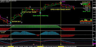
As the name suggests, one method of trading support and resistance levels is right after the bounce.
Many retail Forex traders make the error of setting their orders directly on support and resistance levels and then just waiting to for their trade to materialize.
Sure, this may work at times but this kind of trading method assumes that a support or resistance level will hold without price actually getting there yet.
You might be thinking, “Why don’t I just set an entry order right on the line? That way, I am assured the best possible price.” When playing the bounce, we want to tilt the odds in our favor and find some sort of confirmation that the support or resistance will hold.
For example, instead of simply buying right off the bat, we want to wait for it to bounce first before entering.

If you’ve been looking to go short, you want to wait for it bounce off resistance before entering.

By doing this, you avoid those moments where price moves fast and break through support and resistance levels. From experience, catching a falling knife when trading forex can get really bloody!
In a perfect Forex trading world, we could just jump in and out whenever price hits those major support and resistance levels and earn loads of money. The fact of the matter is that these levels break… often.
So, it’s not enough to just play bounces. You should also know what to do whenever support and resistance levels give way!
There are two ways to play breaks in Forex trading: the aggressive way or the conservative way.

The simplest way to play breakouts is to buy or sell whenever price passes convincingly through a support or resistance zone.
The key word here is convincing because we only want to enter when price passes through a significant support or resistance level with ease.
We want the support or resistance area to act as if it just received a Chuck Norris karate chop: We want it to wilt over in pain as price breaks right through it.


Imagine this hypothetical situation: you decided to go long EUR/USD hoping it would rise after bouncing from a support level.
Soon after, support breaks and you are now holding on to a losing position, with your account balance slowly falling. Do you…
A. Accept defeat, get the heck out, and liquidate your position?
or
B. Hold on to your trade and hope price rises up again?
If your choice is the second one, then you will easily understand this type of Forex trading method.
Remember, whenever you close out a position, you take the opposite side of the trade.
Closing your EUR/US D long trade at or near breakeven means you will have to short the EUR/USD by the same amount.
Now, if enough selling and liquidation of losing positions happens at the broken support level, price will reverse and start falling again. This phenomenon is the main reason why broken support levels become resistance whenever they break.
As you would’ve guessed, taking advantage of this phenomenon is all about being patient.
Instead of entering right on the break, wait for price to make a “pullback” to the broken support or resistance level and enter after the price bounces.
 A
few words of caution… IN FOREX, THIS DOES NOT HAPPEN ALL THE TIME.
“RETESTS” OF BROKEN SUPPORT AND RESISTANCE LEVELS DO NOT HAPPEN ALL THE
TIME. THERE WILL BE TIMES THAT PRICE WILL JUST MOVE IN ONE DIRECTION AND
LEAVE YOU BEHIND. BECAUSE OF THIS, ALWAYS USE STOP LOSS ORDERS AND
NEVER EVER HOLD ON TO A TRADE JUST BECAUSE OF HOPE.
A
few words of caution… IN FOREX, THIS DOES NOT HAPPEN ALL THE TIME.
“RETESTS” OF BROKEN SUPPORT AND RESISTANCE LEVELS DO NOT HAPPEN ALL THE
TIME. THERE WILL BE TIMES THAT PRICE WILL JUST MOVE IN ONE DIRECTION AND
LEAVE YOU BEHIND. BECAUSE OF THIS, ALWAYS USE STOP LOSS ORDERS AND
NEVER EVER HOLD ON TO A TRADE JUST BECAUSE OF HOPE.
Whoops, sorry about that folks, the caps lock key got stuck.
Because here at Alpo's Forex Academy we want to make things easy to understand, we have divided how to trade support and resistance levels into two simple ideas: the Bounce and the Break.
The Bounce
As the name suggests, one method of trading support and resistance levels is right after the bounce.
Many retail Forex traders make the error of setting their orders directly on support and resistance levels and then just waiting to for their trade to materialize.
Sure, this may work at times but this kind of trading method assumes that a support or resistance level will hold without price actually getting there yet.
You might be thinking, “Why don’t I just set an entry order right on the line? That way, I am assured the best possible price.” When playing the bounce, we want to tilt the odds in our favor and find some sort of confirmation that the support or resistance will hold.
For example, instead of simply buying right off the bat, we want to wait for it to bounce first before entering.
If you’ve been looking to go short, you want to wait for it bounce off resistance before entering.
By doing this, you avoid those moments where price moves fast and break through support and resistance levels. From experience, catching a falling knife when trading forex can get really bloody!
The Break
In a perfect world, support and resistance levels would hold forever, McDonald’s would be healthy, and we’d all have jet packs.In a perfect Forex trading world, we could just jump in and out whenever price hits those major support and resistance levels and earn loads of money. The fact of the matter is that these levels break… often.
So, it’s not enough to just play bounces. You should also know what to do whenever support and resistance levels give way!
There are two ways to play breaks in Forex trading: the aggressive way or the conservative way.
The Aggressive Way
The simplest way to play breakouts is to buy or sell whenever price passes convincingly through a support or resistance zone.
The key word here is convincing because we only want to enter when price passes through a significant support or resistance level with ease.
We want the support or resistance area to act as if it just received a Chuck Norris karate chop: We want it to wilt over in pain as price breaks right through it.
The Conservative Way
Imagine this hypothetical situation: you decided to go long EUR/USD hoping it would rise after bouncing from a support level.
Soon after, support breaks and you are now holding on to a losing position, with your account balance slowly falling. Do you…
A. Accept defeat, get the heck out, and liquidate your position?
or
B. Hold on to your trade and hope price rises up again?
If your choice is the second one, then you will easily understand this type of Forex trading method.
Remember, whenever you close out a position, you take the opposite side of the trade.
Closing your EUR/US D long trade at or near breakeven means you will have to short the EUR/USD by the same amount.
Now, if enough selling and liquidation of losing positions happens at the broken support level, price will reverse and start falling again. This phenomenon is the main reason why broken support levels become resistance whenever they break.
As you would’ve guessed, taking advantage of this phenomenon is all about being patient.
Instead of entering right on the break, wait for price to make a “pullback” to the broken support or resistance level and enter after the price bounces.
A
few words of caution… IN FOREX, THIS DOES NOT HAPPEN ALL THE TIME.
“RETESTS” OF BROKEN SUPPORT AND RESISTANCE LEVELS DO NOT HAPPEN ALL THE
TIME. THERE WILL BE TIMES THAT PRICE WILL JUST MOVE IN ONE DIRECTION AND
LEAVE YOU BEHIND. BECAUSE OF THIS, ALWAYS USE STOP LOSS ORDERS AND
NEVER EVER HOLD ON TO A TRADE JUST BECAUSE OF HOPE. Whoops, sorry about that folks, the caps lock key got stuck.
Summary: Trading Support and Resistance
When the market moves up and then pulls back, the highest point reached before it pulls back is now resistance.
As the market continues up again, the lowest point reached before it climbs back up is now support.
One thing to remember is that horizontal support and resistance levels are not exact numbers. To help you filter out these false breakouts, you should think of support and resistance more of as “zones” rather than concrete numbers.
One way to help you find these zones is to plot support and resistance on a line chart rather than a candlestick chart.
Another thing to remember is that when price passes through a resistance level, that resistance could potentially become support. The same could also happen with a support level. If a support level is broken, it could potentially become a resistance level

In a downtrend, the trend line is drawn along the top of easily identifiable resistance areas (peaks).
There are three types of trends:
To create a down (descending) channel, simply draw a parallel line at the same angle as the downtrend line and then move that line to a position where it touches the most recent valley.
When trading the bounce we want to tilt the odds in our favor and find some sort of confirmation that the support or resistance will hold. Instead of simply buying or selling right off the bat, wait for it to bounce first before entering.
By doing this, you avoid those moments where price moves so fast that it slices through support and resistance levels like a knife slicing through warm butter.
As for trading the break, there is the aggressive way and there is the conservative way.
In the aggressive way, you simply buy or sell whenever the price passes through a support or resistance zone with ease.
In the conservative way, you wait for price to make a “pullback” to the broken support or resistance level and enter after price bounces.
As the market continues up again, the lowest point reached before it climbs back up is now support.
One thing to remember is that horizontal support and resistance levels are not exact numbers. To help you filter out these false breakouts, you should think of support and resistance more of as “zones” rather than concrete numbers.
One way to help you find these zones is to plot support and resistance on a line chart rather than a candlestick chart.
Another thing to remember is that when price passes through a resistance level, that resistance could potentially become support. The same could also happen with a support level. If a support level is broken, it could potentially become a resistance level
Trend Lines
In their most basic form, an uptrend line is drawn along the bottom of easily identifiable support areas (valleys).In a downtrend, the trend line is drawn along the top of easily identifiable resistance areas (peaks).
There are three types of trends:
- Uptrend (higher lows)
- Downtrend (lower highs)
- Sideways trends (ranging)
Channels
To create an up (ascending) channel, simply draw a parallel line at the same angle as an uptrend line and then move that line to a position where it touches the most recent peak.To create a down (descending) channel, simply draw a parallel line at the same angle as the downtrend line and then move that line to a position where it touches the most recent valley.
- Ascending channel (higher highs and higher lows)
- Descending channel (lower highers and lower lows)
- Horizontal channel (ranging)
When trading the bounce we want to tilt the odds in our favor and find some sort of confirmation that the support or resistance will hold. Instead of simply buying or selling right off the bat, wait for it to bounce first before entering.
By doing this, you avoid those moments where price moves so fast that it slices through support and resistance levels like a knife slicing through warm butter.
As for trading the break, there is the aggressive way and there is the conservative way.
In the aggressive way, you simply buy or sell whenever the price passes through a support or resistance zone with ease.
In the conservative way, you wait for price to make a “pullback” to the broken support or resistance level and enter after price bounces.
Quiz Time!
Support and Resistance Level
Support and resistance levels are essential for technical traders. Test how much you know by taking this quiz.
2. Trend Lines
Trend lines are probably the most common form of technical analysis in Forex trading.
They are probably one of the most underutilized ones as well.
If drawn correctly, they can be as accurate as any other method.
Unfortunately, most Forex traders don’t draw them correctly or try to make the line fit the market instead of the other way around.
In their most basic form, an uptrend line is drawn along the bottom of easily identifiable support areas (valleys).
In a downtrend, the trend line is drawn along the top of easily identifiable resistance areas (peaks).
What’s next?
Nothing.
Uhh, is that it?
Yep, it’s that simple.
Here are trend lines in action! Look at those waves!

Like horizontal support and resistance levels, trend lines become stronger the more times they are tested.
And most importantly, DO NOT EVER draw trend lines by forcing them to fit the market. If they do not fit right, then that trend line isn’t a valid one!
They are probably one of the most underutilized ones as well.
If drawn correctly, they can be as accurate as any other method.
Unfortunately, most Forex traders don’t draw them correctly or try to make the line fit the market instead of the other way around.
In their most basic form, an uptrend line is drawn along the bottom of easily identifiable support areas (valleys).
In a downtrend, the trend line is drawn along the top of easily identifiable resistance areas (peaks).
How do you draw trend lines?
To draw forex trend lines properly, all you have to do is locate two major tops or bottoms and connect them.What’s next?
Nothing.
Uhh, is that it?
Yep, it’s that simple.
Here are trend lines in action! Look at those waves!

Types of Trends
There are three types of trends:- Uptrend (higher lows)
- Downtrend (lower highs)
- Sideways trends (ranging)
Here are some important things to remember using trend lines in Forex trading:
It takes at least two tops or bottoms to draw a valid trend line but it takes THREE to confirm a trend line. The STEEPER the trend line you draw, the less reliable it is going to be and the more likely it will break.Like horizontal support and resistance levels, trend lines become stronger the more times they are tested.
And most importantly, DO NOT EVER draw trend lines by forcing them to fit the market. If they do not fit right, then that trend line isn’t a valid one!
3. Channels
If we take this trend line theory one step further and draw a
parallel line at the same angle of the uptrend or downtrend, we will
have created a channel.
No, we’re not talking about ESPN, National Geographic Channel or Cartoon Network.
Still, this doesn’t mean that you should walk away like it’s a commercial break- channels can be just as exciting to watch as Game of Thrones or Keeping Up with the Kardashians! Channels are just another tool in technical analysis which can be used to determine good places to buy or sell.
Both the tops and bottoms of channels represent potential areas of support or resistance.

To create an up (ascending) channel, simply draw a parallel line at the same angle as an uptrend line and then move that line to position where it touches the most recent peak. This should be done at the same time you create the trend line.
To create a down (descending) channel, simply draw a parallel line at the same angle as the downtrend line and then move that line to a position where it touches the most recent valley. This should be done at the same time you create the trend line. When prices hit the LOWER trend line, this may be used as a buying area.
When prices hit the UPPER trend line, this may be used as a selling area.
Generally, the bottom of channel is considered a buy zone while the top of channel is considered a sell zone. Like in drawing trend lines, DO NOT EVER force the price to the channels that you draw!
A channel boundary that is sloping at one angle while the corresponding channel boundary is sloping at another is not correct and could lead to bad trades.
No, we’re not talking about ESPN, National Geographic Channel or Cartoon Network.
Still, this doesn’t mean that you should walk away like it’s a commercial break- channels can be just as exciting to watch as Game of Thrones or Keeping Up with the Kardashians! Channels are just another tool in technical analysis which can be used to determine good places to buy or sell.
Both the tops and bottoms of channels represent potential areas of support or resistance.

To create an up (ascending) channel, simply draw a parallel line at the same angle as an uptrend line and then move that line to position where it touches the most recent peak. This should be done at the same time you create the trend line.
To create a down (descending) channel, simply draw a parallel line at the same angle as the downtrend line and then move that line to a position where it touches the most recent valley. This should be done at the same time you create the trend line. When prices hit the LOWER trend line, this may be used as a buying area.
When prices hit the UPPER trend line, this may be used as a selling area.
Types of channels
There are three types of channels:- Ascending channel (higher highs and higher lows)
- Descending channel (lower highs and lower lows)
- Horizontal channel (ranging)
Important things to remember about drawing trend lines:
When constructing a channel, both trend lines must be parallel to each other.Generally, the bottom of channel is considered a buy zone while the top of channel is considered a sell zone. Like in drawing trend lines, DO NOT EVER force the price to the channels that you draw!
A channel boundary that is sloping at one angle while the corresponding channel boundary is sloping at another is not correct and could lead to bad trades.
4. Japanese Candlestick
What is a Japanese Candlestick?
While we briefly covered Japanese candlestick charting analysis in
the previous Forex lesson, we’ll now dig in a little and discuss them
more in detail. Let’s do a quick review first.
A Westerner by the name of Steve Nison “discovered” this secret technique called “Japanese candlesticks,” learning it from a fellow Japanese broker.
Steve researched, studied, lived, breathed, ate candlesticks, and began to write about it.
Slowly, this secret technique grew in popularity in the 90’s. To make a long story short, without Steve Nison, candlestick charts might have remained a buried secret.
Steve Nison is Mr. Candlestick.

Japanese candlesticks can be used for any time frame, whether it be one day, one hour, 30-minutes – whatever you want! They are used to describe the price action during the given time frame.
Japanese candlesticks are formed using the open, high, low, and close of the chosen time period.
The pattern indicates the indecision between the buyers and sellers.

The small real body (whether hollow or filled) shows little movement from open to close, and the shadows indicate that both buyers and sellers were fighting but nobody could gain the upper hand.
Even though the session opened and closed with little change, prices moved significantly higher and lower in the meantime. Neither buyers nor sellers could gain the upper hand, and the result was a standoff.
Fortunately, that’s not what it means. Marubozu means there are no shadows from the bodies.
Depending on whether the candlestick’s body is filled or hollow, the high and low are the same as its open or close.
Check out the two types of Marubozus in the picture below.

A White Marubozu contains a long white body with no shadows. The open price equals the low price and the close price equals the high price.
This is a very bullish candle as it shows that buyers were in control the entire session. It usually becomes the first part of a bullish continuation or a bullish reversal pattern. A Black Marubozu contains a long black body with no shadows. The open equals the high and the close equals the low.
This is a very bearish candle as it shows that sellers controlled the price action the entire session. It usually implies bearish continuation or bearish reversal.
Doji candles suggest indecision or a struggle for turf positioning between buyers and sellers. Prices move above and below the open price during the session, but close at or very near the open price.
Neither buyers nor sellers were able to gain control and the result was essentially a draw.
There are FOUR special types of Doji candlesticks.
The length of the upper and lower shadows can vary and the resulting forex candlestick looks like a cross, inverted cross or plus sign.
The word “Doji” refers to both the singular and plural form.

When a Doji forms on your chart, pay special attention to the preceding candlesticks.
If a Doji forms after a series of candlesticks with long hollow bodies (like White Marubozus), the Doji signals that the buyers are becoming exhausted and weakening. In order for
In order for price to continue rising, more buyers are needed but there aren’t anymore! Sellers are licking their chops and are looking to come in and drive the price back down.

If a Doji forms after a series of candlesticks with long filled bodies (like Black Marubozus), the Doji signals that sellers are becoming exhausted and weak. In order for
In order for price to continue falling, more sellers are needed but sellers are all tapped out! Buyers are foaming in the mouth for a chance to get in cheap.
 While the decline is sputtering due to lack of new sellers, further buying strength is required to confirm any reversal.
Look for a white candlestick to close above the long black candlestick’s open. In the next following sections, we will take a look at specific Japanese candlestick pattern and what they are telling us.
Hopefully, by the end of this lesson on candlesticks, you will know how to recognize different types of forex candlestick patterns and make sound trading decisions based on them.

Fibonacci ratios are used a lot in forex trading, so you better make sure you know all about them. Brush up on the subject matter by taking this short test.

It may be a simple concept to grasp, but have you mastered moving averages? Let’s put your forex knowledge to the test!
Japanese Candlestick Trading
Back in the day when Godzilla was still a cute little lizard, the Japanese created their own old school version of technical analysis to trade rice. That’s right, rice.A Westerner by the name of Steve Nison “discovered” this secret technique called “Japanese candlesticks,” learning it from a fellow Japanese broker.
Steve researched, studied, lived, breathed, ate candlesticks, and began to write about it.
Slowly, this secret technique grew in popularity in the 90’s. To make a long story short, without Steve Nison, candlestick charts might have remained a buried secret.
Steve Nison is Mr. Candlestick.
What are Japanese candlesticks?
The best way to explain is by using a picture:Japanese candlesticks can be used for any time frame, whether it be one day, one hour, 30-minutes – whatever you want! They are used to describe the price action during the given time frame.
Japanese candlesticks are formed using the open, high, low, and close of the chosen time period.
- If the close is above the open, then a hollow candlestick (usually displayed as white) is drawn.
- If the close is below the open, then a filled candlestick (usually displayed as black) is drawn.
- The hollow or filled section of the candlestick is called the “real body” or body.
- The thin lines poking above and below the body display the high/low range and are called shadows.
- The top of the upper shadow is the “high”.
- The bottom of the lower shadow is the “low”.
Japanese Candlestick Anatomy
Let’s break down the different parts of a Japanese candlestick.

Long bodies indicate strong buying or selling. The longer the body is, the more intense the buying or selling pressure. This means that either buyers or sellers were stronger and took control.
Short bodies imply very little buying or selling activity. In forex lingo, bulls mean buyers and bears mean sellers. Long white Japanese candlesticks show strong buying pressure.
The longer the white candlestick, the further the close is above the open.
This indicates that prices increased considerably from open to close and buyers were aggressive. In other words, the bulls are kicking the bears’ butts big time!
Long black (filled) candlesticks show strong selling pressure. The longer the black Japanese candlestick, the further the close is below the open.
This indicates that prices fell a great deal from the open and sellers were aggressive. In other words, the bears were grabbing the bulls by their horns and body-slamming them.
The upper and lower shadows on Japanese candlesticks provide important clues about the trading session.
Upper shadows signify the session high.
Lower shadows signify the session low.
Candlesticks with long shadows show that trading action occurred well past the open and close.
Japanese candlesticks with short shadows indicate that most of the trading action was confined near the open and close.

If a Japanese candlestick has a long upper shadow and short lower shadow, this means that buyers flexed their muscles and bid prices higher. But for one reason or another, sellers came in and drove prices back down to end the session back near its open price.
If a Japanese candlestick has a long lower shadow and short upper shadow, this means that sellers flashed their washboard abs and forced price lower.
But for one reason or another, buyers came in and drove prices back up to end the session back near its open price.
Sexy Bodies
Just like humans, candlesticks have different body sizes. And when it comes to forex trading, there’s nothing naughtier than checking out the bodies of candlesticks!Long bodies indicate strong buying or selling. The longer the body is, the more intense the buying or selling pressure. This means that either buyers or sellers were stronger and took control.
Short bodies imply very little buying or selling activity. In forex lingo, bulls mean buyers and bears mean sellers.
Long white Japanese candlesticks show strong buying pressure.The longer the white candlestick, the further the close is above the open.
This indicates that prices increased considerably from open to close and buyers were aggressive. In other words, the bulls are kicking the bears’ butts big time!
Long black (filled) candlesticks show strong selling pressure. The longer the black Japanese candlestick, the further the close is below the open.
This indicates that prices fell a great deal from the open and sellers were aggressive. In other words, the bears were grabbing the bulls by their horns and body-slamming them.
Mysterious Shadows
No, we’re not talking about wearing dark smokey eye shadow.The upper and lower shadows on Japanese candlesticks provide important clues about the trading session.
Upper shadows signify the session high.
Lower shadows signify the session low.
Candlesticks with long shadows show that trading action occurred well past the open and close.
Japanese candlesticks with short shadows indicate that most of the trading action was confined near the open and close.
If a Japanese candlestick has a long upper shadow and short lower shadow, this means that buyers flexed their muscles and bid prices higher. But for one reason or another, sellers came in and drove prices back down to end the session back near its open price.
If a Japanese candlestick has a long lower shadow and short upper shadow, this means that sellers flashed their washboard abs and forced price lower.
But for one reason or another, buyers came in and drove prices back up to end the session back near its open price.
Basic Japanese Candlestick Patterns
Spinning Tops
Japanese candlesticks with a long upper shadow, long lower shadow and small real bodies are called spinning tops. The color of the real body is not very important.The pattern indicates the indecision between the buyers and sellers.
The small real body (whether hollow or filled) shows little movement from open to close, and the shadows indicate that both buyers and sellers were fighting but nobody could gain the upper hand.
Even though the session opened and closed with little change, prices moved significantly higher and lower in the meantime. Neither buyers nor sellers could gain the upper hand, and the result was a standoff.
- If a spinning top forms during an uptrend, this usually means there aren’t many buyers left and a possible reversal in direction could occur.
- If a spinning top forms during a downtrend, this usually means there aren’t many sellers left and a possible reversal in direction could occur.
Marubozu
Sounds like some kind of voodoo magic, huh? “I will cast the evil spell of the Marubozu on you!”Fortunately, that’s not what it means. Marubozu means there are no shadows from the bodies.
Depending on whether the candlestick’s body is filled or hollow, the high and low are the same as its open or close.
Check out the two types of Marubozus in the picture below.
A White Marubozu contains a long white body with no shadows. The open price equals the low price and the close price equals the high price.
This is a very bullish candle as it shows that buyers were in control the entire session. It usually becomes the first part of a bullish continuation or a bullish reversal pattern. A Black Marubozu contains a long black body with no shadows. The open equals the high and the close equals the low.
This is a very bearish candle as it shows that sellers controlled the price action the entire session. It usually implies bearish continuation or bearish reversal.
Doji
Doji candlesticks have the same open and close price or at least their bodies are extremely short. A doji should have a very small body that appears as a thin line.Doji candles suggest indecision or a struggle for turf positioning between buyers and sellers. Prices move above and below the open price during the session, but close at or very near the open price.
Neither buyers nor sellers were able to gain control and the result was essentially a draw.
There are FOUR special types of Doji candlesticks.
The length of the upper and lower shadows can vary and the resulting forex candlestick looks like a cross, inverted cross or plus sign.
The word “Doji” refers to both the singular and plural form.
When a Doji forms on your chart, pay special attention to the preceding candlesticks.
If a Doji forms after a series of candlesticks with long hollow bodies (like White Marubozus), the Doji signals that the buyers are becoming exhausted and weakening. In order for
In order for price to continue rising, more buyers are needed but there aren’t anymore! Sellers are licking their chops and are looking to come in and drive the price back down.
If a Doji forms after a series of candlesticks with long filled bodies (like Black Marubozus), the Doji signals that sellers are becoming exhausted and weak. In order for
In order for price to continue falling, more sellers are needed but sellers are all tapped out! Buyers are foaming in the mouth for a chance to get in cheap.
While the decline is sputtering due to lack of new sellers, further buying strength is required to confirm any reversal.Look for a white candlestick to close above the long black candlestick’s open. In the next following sections, we will take a look at specific Japanese candlestick pattern and what they are telling us.
Hopefully, by the end of this lesson on candlesticks, you will know how to recognize different types of forex candlestick patterns and make sound trading decisions based on them.
Single Candlestick Patterns
Learn how to use single candlestick patterns to identify potential market reversals.
Here are the four basic single Japanese candlestick patterns:
Both have cute little bodies (black or white), long lower shadows, and short or absent upper shadows.


The hammer is a bullish reversal pattern that forms during a downtrend. It is named because the market is hammering out a bottom.
When price is falling, hammers signal that the bottom is near and price will start rising again. The long lower shadow indicates that sellers pushed prices lower, but buyers were able to overcome this selling pressure and closed near the open.
Just because you see a hammer form in a downtrend doesn’t mean you automatically place a buy order! More bullish confirmation is needed before it’s safe to pull the trigger.
A typical example of confirmation would be to wait for a white candlestick to close above the open to the right side of the hammer.
When price is rising, the formation of a hanging man indicates that sellers are beginning to outnumber buyers.
The long lower shadow shows that sellers pushed prices lower during the session. Buyers were able to push the price back up some but only near the open.
This should set off alarms since this tells us that there are no buyers left to provide the necessary momentum to keep raising the price.
An inverted hammer is a bullish reversal candlestick.
A shooting star is a bearish reversal candlestick.
Both candlesticks have petite little bodies (filled or hollow), long upper shadows, and small or absent lower shadows.


The inverted hammer occurs when price has been falling suggests the possibility of a reversal. Its long upper shadow shows that buyers tried to bid the price higher.
However, sellers saw what the buyers were doing, said “Oh heck no!” and attempted to push the price back down.
Fortunately, the buyers had eaten enough of their Wheaties for breakfast and still managed to close the session near the open. Since the sellers weren’t able to close the price any lower, this is a good indication that everybody who wants to sell has already sold.
And if there are no more sellers, who is left? Buyers.
The shooting star is a bearish reversal pattern that looks identical to the inverted hammer but occurs when price has been rising.
Its shape indicates that the price opened at its low, rallied, but pulled back to the bottom.
This means that buyers attempted to push the price up, but sellers came in and overpowered them. This is a definite bearish sign since there are no more buyers left because they’ve all been murdered.
Here are the four basic single Japanese candlestick patterns:
Hammer and Hanging Man
The hammer and hanging man look exactly alike but have totally different meanings depending on past price action.Both have cute little bodies (black or white), long lower shadows, and short or absent upper shadows.
The hammer is a bullish reversal pattern that forms during a downtrend. It is named because the market is hammering out a bottom.
When price is falling, hammers signal that the bottom is near and price will start rising again. The long lower shadow indicates that sellers pushed prices lower, but buyers were able to overcome this selling pressure and closed near the open.
Just because you see a hammer form in a downtrend doesn’t mean you automatically place a buy order! More bullish confirmation is needed before it’s safe to pull the trigger.
A typical example of confirmation would be to wait for a white candlestick to close above the open to the right side of the hammer.
Recognition Criteria for Hammer:
- The long shadow is about two or three times of the real body.
- Little or no upper shadow.
- The real body is at the upper end of the trading range.
- The color of the real body is not important.
When price is rising, the formation of a hanging man indicates that sellers are beginning to outnumber buyers.
The long lower shadow shows that sellers pushed prices lower during the session. Buyers were able to push the price back up some but only near the open.
This should set off alarms since this tells us that there are no buyers left to provide the necessary momentum to keep raising the price.
Recognition Criteria Hanging Man:
- A long lower shadow which is about two or three times of the real body.
- Little or no upper shadow.
- The real body is at the upper end of the trading range.
- The color of the body is not important, though a black body is more bearish than a white body.
Inverted Hammer and Shooting Star
The inverted hammer and shooting star also look identical. The only difference between them is whether you’re in a downtrend or uptrend.An inverted hammer is a bullish reversal candlestick.
A shooting star is a bearish reversal candlestick.
Both candlesticks have petite little bodies (filled or hollow), long upper shadows, and small or absent lower shadows.
The inverted hammer occurs when price has been falling suggests the possibility of a reversal. Its long upper shadow shows that buyers tried to bid the price higher.
However, sellers saw what the buyers were doing, said “Oh heck no!” and attempted to push the price back down.
Fortunately, the buyers had eaten enough of their Wheaties for breakfast and still managed to close the session near the open. Since the sellers weren’t able to close the price any lower, this is a good indication that everybody who wants to sell has already sold.
And if there are no more sellers, who is left? Buyers.
The shooting star is a bearish reversal pattern that looks identical to the inverted hammer but occurs when price has been rising.
Its shape indicates that the price opened at its low, rallied, but pulled back to the bottom.
This means that buyers attempted to push the price up, but sellers came in and overpowered them. This is a definite bearish sign since there are no more buyers left because they’ve all been murdered.
Dual Candlestick Patterns
What’s better than single candlestick patterns?
DUAL candlestick patterns!

The bullish engulfing pattern is a two candlestick pattern that signals a strong up move may be coming.
It happens when a bearish candle is immediately followed by a larger bullish candle. This second candle “engulfs” the bearish candle. This means buyers are flexing their muscles and that there could be a strong up move after a recent downtrend or a period of consolidation.
On the other hand, the bearish engulfing pattern is the opposite of the bullish pattern.
This type of candlestick pattern occurs when the bullish candle is immediately followed by a bearish candle that completely “engulfs” it. This means that sellers overpowered the buyers and that a strong move down could happen.
This type of candlestick pattern are usually be spotted after an extended uptrend or downtrend, indicating that a reversal will soon occur.
Notice how the candlestick formation looks just like a pair of tweezers!
Amazing!

The most effective Tweezers have the following characteristics:
The first candlestick is the same as the overall trend. If price is moving up, then the first candle should be bullish. The second candlestick is opposite the overall trend. If price is moving up, then the second candle should be bearish.
The shadows of the candlesticks should be of equal length.
Tweezer Tops should have the same highs, while Tweezer Bottoms should have the same lows.
DUAL candlestick patterns!
Engulfing Candles
The bullish engulfing pattern is a two candlestick pattern that signals a strong up move may be coming.
It happens when a bearish candle is immediately followed by a larger bullish candle. This second candle “engulfs” the bearish candle. This means buyers are flexing their muscles and that there could be a strong up move after a recent downtrend or a period of consolidation.
On the other hand, the bearish engulfing pattern is the opposite of the bullish pattern.
This type of candlestick pattern occurs when the bullish candle is immediately followed by a bearish candle that completely “engulfs” it. This means that sellers overpowered the buyers and that a strong move down could happen.
Tweezer Bottoms and Tops
The tweezers are dual candlestick reversal patterns.This type of candlestick pattern are usually be spotted after an extended uptrend or downtrend, indicating that a reversal will soon occur.
Notice how the candlestick formation looks just like a pair of tweezers!
Amazing!
The most effective Tweezers have the following characteristics:
The first candlestick is the same as the overall trend. If price is moving up, then the first candle should be bullish. The second candlestick is opposite the overall trend. If price is moving up, then the second candle should be bearish.
The shadows of the candlesticks should be of equal length.
Tweezer Tops should have the same highs, while Tweezer Bottoms should have the same lows.
Summary: Japanese Candlesticks
We’ve covered a lot about Japanese candlesticks. Hopefully, you’re not at wick’s end but are actually now fired up about candlestick charts.
Maybe we’ve even ignited a flame that becomes a lifelong passion for Japanese candlesticks.
Let’s summarize what you’ve learned about Japanese candlesticks:
 Long bodies indicate strong buying or selling. The longer the body is, the more intense the buying or selling pressure.
Short bodies imply very little buying or selling activity. In street forex lingo, bulls mean buyers and bears mean sellers. Upper shadows signify the session high.
Lower shadows signify the session low.
There are many types of Japanese candlestick patterns, but they can be categorized into how many bars make up the candlestick pattern. There are single, dual, and triple candlestick formations.
The most common types of Japanese candlestick patterns are the following:
Just refer to the Japanese Candlesticks Cheat Sheet for a quick reference on what these candlestick patterns mean.
Combine candlestick analysis with support and resistance levels for best results.
And finally, here are some words of wisdom:
And if you’re looking for a more in-depth look at Japanese Candlesticks, you can’t go wrong with the book, Japanese Candlestick Charting: A Contemporary Guide to the Ancient Techniques of the Far East. It’s written by the man himself, Steve Nison.
Maybe we’ve even ignited a flame that becomes a lifelong passion for Japanese candlesticks.
Let’s summarize what you’ve learned about Japanese candlesticks:
- If the close is above the open, then a hollow candlestick (usually displayed as white) is drawn.
- If the close is below the open, then a filled candlestick (usually displayed as black) is drawn.
- The hollow or filled section of the candlestick is called the “real body” or body.
- The thin lines poking above and below the body display the high/low range and are called shadows.
- The top of the upper shadow is the “high”.
- The bottom of the lower shadow is the “low”.
Short bodies imply very little buying or selling activity. In street forex lingo, bulls mean buyers and bears mean sellers. Upper shadows signify the session high.
Lower shadows signify the session low.
There are many types of Japanese candlestick patterns, but they can be categorized into how many bars make up the candlestick pattern. There are single, dual, and triple candlestick formations.
The most common types of Japanese candlestick patterns are the following:
| Number of Bars | Japanese Candlestick Pattern |
|---|---|
| Single | Spinning Tops, Dojis, Marubozu, Inverted Hammer, Hanging Man, Shooting Star |
| Double | Bullish and Bearish Engulfing, Tweezer Tops and Bottoms |
| Triple | Morning and Evening Stars, Three Black Crows and Three White Soldiers, Three Inside Up and Down |
Combine candlestick analysis with support and resistance levels for best results.
And finally, here are some words of wisdom:
Just because Japanese candlesticks hint at a reversal or continuation, it doesn’t mean it will happen for sure! You must always consider market conditions and what price action is telling you.This is the forex market and nothing is set in stone!
And if you’re looking for a more in-depth look at Japanese Candlesticks, you can’t go wrong with the book, Japanese Candlestick Charting: A Contemporary Guide to the Ancient Techniques of the Far East. It’s written by the man himself, Steve Nison.
5. Fibonacci Trading Indicator
We will be using Fibonacci ratios a lot in our trading so you better learn it and love it like your mother’s home cooking.
Fibonacci is a huge subject and there are many different Fibonacci studies with weird-sounding names but we’re going to stick to two: entrancement and extension.
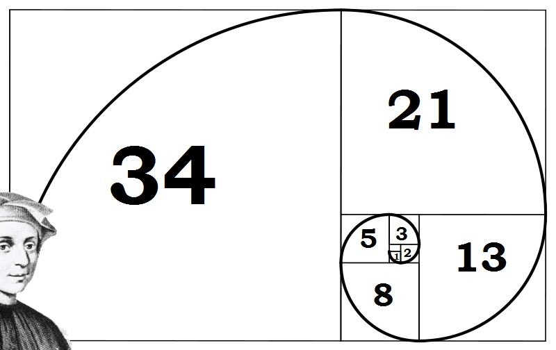
Let us first start by introducing you to the Fib man himself…Leonardo Fibonacci.
No, Leonardo Fibonacci isn’t some famous chef. Actually, he was a famous Italian mathematician, also known as a super duper uber ultra geek.
He had an “Aha!” moment when he discovered a simple series of numbers that created ratios describing the natural proportions of things in the universe.
The ratios arise from the following number series: 0, 1, 1, 2, 3, 5, 8, 13, 21, 34, 55, 89, 144…
This series of numbers is derived by starting with 0 followed by 1 and then adding 0 + 1 to get 1, the third number. Then, adding the second and third number (1 + 1) to get 2, the fourth number, and so on.
After the first few numbers in the sequence, if you measure the ratio of any number to the succeeding higher number, you get .618. For example, 34 divided by 55 equals .618. If you measure the ratio between alternate numbers you get .382. For example, 34 divided by 89 = 0.382 and that’s as far as into the explanation as we’ll go.
These ratios are called the “golden mean”. Okay that’s enough mumbo jumbo. With all those numbers, you could put an elephant to sleep. We’ll just cut to the chase; these are the ratios you HAVE to know:
You won’t really need to know how to calculate all of this. Your charting software will do all the work for you. Besides, we’ve got a nice Fibonacci calculator that can magically calculate those levels for you.
However, it’s always good to be familiar with the basic theory behind the indicator so you’ll have the knowledge to impress your date.
Traders use the Fibonacci retracement levels as potential support and resistance areas.
Since so many traders watch these same levels and place buy and sell orders on them to enter trades or place stops, the support and resistance levels tend to become a self-fulfilling prophecy.
Traders use the Fibonacci extension levels as profit taking levels. Again, since so many traders are watching these levels to place buy and sell orders to take profits, this tool tends to work more often than not due to self-fulfilling expectations.
Most charting software includes both Fibonacci retracement levels and extension level tools.
In order to apply Fibonacci levels to your charts, you’ll need to identify Swing High and Swing Low points.
A Swing High is a candlestick with at least two lower highs on both the left and right of itself.
A Swing Low is a candlestick with at least two higher lows on both the left and right of itself.
You got all that? Don’t worry, we’ll explain retracements, extensions, and most importantly, how to grab some pips using the Fibonacci tool in the following lessons.
Fibonacci is a huge subject and there are many different Fibonacci studies with weird-sounding names but we’re going to stick to two: entrancement and extension.
Let us first start by introducing you to the Fib man himself…Leonardo Fibonacci.
No, Leonardo Fibonacci isn’t some famous chef. Actually, he was a famous Italian mathematician, also known as a super duper uber ultra geek.
He had an “Aha!” moment when he discovered a simple series of numbers that created ratios describing the natural proportions of things in the universe.
The ratios arise from the following number series: 0, 1, 1, 2, 3, 5, 8, 13, 21, 34, 55, 89, 144…
This series of numbers is derived by starting with 0 followed by 1 and then adding 0 + 1 to get 1, the third number. Then, adding the second and third number (1 + 1) to get 2, the fourth number, and so on.
After the first few numbers in the sequence, if you measure the ratio of any number to the succeeding higher number, you get .618. For example, 34 divided by 55 equals .618. If you measure the ratio between alternate numbers you get .382. For example, 34 divided by 89 = 0.382 and that’s as far as into the explanation as we’ll go.
These ratios are called the “golden mean”. Okay that’s enough mumbo jumbo. With all those numbers, you could put an elephant to sleep. We’ll just cut to the chase; these are the ratios you HAVE to know:
Fibonacci Retracement Levels
0.236, 0.382, 0.500, 0.618, 0.764Fibonacci Extension Levels
0, 0.382, 0.618, 1.000, 1.382, 1.618You won’t really need to know how to calculate all of this. Your charting software will do all the work for you. Besides, we’ve got a nice Fibonacci calculator that can magically calculate those levels for you.
However, it’s always good to be familiar with the basic theory behind the indicator so you’ll have the knowledge to impress your date.
Traders use the Fibonacci retracement levels as potential support and resistance areas.
Since so many traders watch these same levels and place buy and sell orders on them to enter trades or place stops, the support and resistance levels tend to become a self-fulfilling prophecy.
Traders use the Fibonacci extension levels as profit taking levels. Again, since so many traders are watching these levels to place buy and sell orders to take profits, this tool tends to work more often than not due to self-fulfilling expectations.
Most charting software includes both Fibonacci retracement levels and extension level tools.
In order to apply Fibonacci levels to your charts, you’ll need to identify Swing High and Swing Low points.
A Swing High is a candlestick with at least two lower highs on both the left and right of itself.
A Swing Low is a candlestick with at least two higher lows on both the left and right of itself.
You got all that? Don’t worry, we’ll explain retracements, extensions, and most importantly, how to grab some pips using the Fibonacci tool in the following lessons.
How to Use Fibonacci Retracement to Enter a Forex Trade
The first thing you should know about the Fibonacci tool is that it works best when the forex market is trending.
The idea is to go long (or buy) on a retracement at a Fibonacci support level when the market is trending up, and to go short (or sell) on a retracement at a Fibonacci resistance level when the market is trending down.
For uptrends, do the opposite. Click on the Swing Low and drag the cursor to the most recent Swing High.
Got that? Now, let’s take a look at some examples on how to apply Fibonacci retracements levels to the currency markets.

Here we plotted the Fibonacci retracement levels by clicking on the Swing Low at .6955 on April 20 and dragging the cursor to the Swing High at .8264 on June 3.
Tada! The software magically shows you the retracement levels.
As you can see from the chart, the Fibonacci retracement levels were .7955 (23.6%), .7764 (38.2%), .7609 (50.0%), .7454 (61.8%), and .7263 (76.4%).
Now, the expectation is that if AUD/USD retraces from the recent high, it will find support at one of those Fibonacci retracement levels because traders will be placing buy orders at these levels as price pulls back.
Now, let’s look at what happened after the Swing High occurred.

Price pulled back right through the 23.6% level and continued to shoot down over the next couple of weeks.
It even tested the 38.2% level but was unable to close below it. Later on, around July 14, the market resumed its upward move and eventually broke through the swing high.
Clearly, buying at the 38.2% Fibonacci level would have been a profitable long-term trade!

As you can see, we found our Swing High at 1.4195 on January 25 and our Swing Low at 1.3854 a few days later on February 1.
The retracement levels are 1.3933 (23.6%), 1.3983 (38.2%), 1.4023 (50.0%), 1.4064 (61.8%) and 1.4114 (76.4%).
The expectation for a downtrend is that if price retraces from this low, it could possibly encounter resistance at one of the Fibonacci levels because traders who want to play the downtrend at better prices may be ready with sell orders there.
Let’s take a look at what happened next.

Yowza, isn’t that a thing of beauty?!
The market did try to rally, stalled below the 38.2% level for a bit before testing the 50.0% level.
If you had some orders either at the 38.2% or 50.0% levels, you would’ve made some mad pips on that trade. In these two examples, we see that price found some temporary forex support or resistance at Fibonacci retracement levels.
Because of all the people who use the Fibonacci tool, those levels become self-fulfilling support and resistance levels.
One thing you should take note of is that price won’t always bounce from these levels. They should be looked at as areas of interest, or as Cyclopip likes to call them, “KILL ZONES!” We’ll teach you more about that later on.
For now, there’s something you should always remember about using the Fibonacci tool and it’s that they are not always simple to use! If they were that simple, traders would always place their orders at Fibonacci retracement levels and the markets would trend forever.
In the next lesson, we’ll show you what can happen when Fibonacci retracement levels fail.
The idea is to go long (or buy) on a retracement at a Fibonacci support level when the market is trending up, and to go short (or sell) on a retracement at a Fibonacci resistance level when the market is trending down.
Finding Fibonacci Retracement Levels
In order to find these Fibonacci retracement levels, you have to find the recent significant Swing Highs and Swings Lows. Then, for downtrends, click on the Swing High and drag the cursor to the most recent Swing Low.For uptrends, do the opposite. Click on the Swing Low and drag the cursor to the most recent Swing High.
Got that? Now, let’s take a look at some examples on how to apply Fibonacci retracements levels to the currency markets.
Uptrend
This is a daily chart of AUD/USD.
Here we plotted the Fibonacci retracement levels by clicking on the Swing Low at .6955 on April 20 and dragging the cursor to the Swing High at .8264 on June 3.
Tada! The software magically shows you the retracement levels.
As you can see from the chart, the Fibonacci retracement levels were .7955 (23.6%), .7764 (38.2%), .7609 (50.0%), .7454 (61.8%), and .7263 (76.4%).
Now, the expectation is that if AUD/USD retraces from the recent high, it will find support at one of those Fibonacci retracement levels because traders will be placing buy orders at these levels as price pulls back.
Now, let’s look at what happened after the Swing High occurred.

Price pulled back right through the 23.6% level and continued to shoot down over the next couple of weeks.
It even tested the 38.2% level but was unable to close below it. Later on, around July 14, the market resumed its upward move and eventually broke through the swing high.
Clearly, buying at the 38.2% Fibonacci level would have been a profitable long-term trade!
Downtrend
Now, let’s see how we would use the Fibonacci retracement tool during a downtrend. Below is a 4-hour chart of EUR/USD.
As you can see, we found our Swing High at 1.4195 on January 25 and our Swing Low at 1.3854 a few days later on February 1.
The retracement levels are 1.3933 (23.6%), 1.3983 (38.2%), 1.4023 (50.0%), 1.4064 (61.8%) and 1.4114 (76.4%).
The expectation for a downtrend is that if price retraces from this low, it could possibly encounter resistance at one of the Fibonacci levels because traders who want to play the downtrend at better prices may be ready with sell orders there.
Let’s take a look at what happened next.

Yowza, isn’t that a thing of beauty?!
The market did try to rally, stalled below the 38.2% level for a bit before testing the 50.0% level.
If you had some orders either at the 38.2% or 50.0% levels, you would’ve made some mad pips on that trade. In these two examples, we see that price found some temporary forex support or resistance at Fibonacci retracement levels.
Because of all the people who use the Fibonacci tool, those levels become self-fulfilling support and resistance levels.
One thing you should take note of is that price won’t always bounce from these levels. They should be looked at as areas of interest, or as Cyclopip likes to call them, “KILL ZONES!” We’ll teach you more about that later on.
For now, there’s something you should always remember about using the Fibonacci tool and it’s that they are not always simple to use! If they were that simple, traders would always place their orders at Fibonacci retracement levels and the markets would trend forever.
In the next lesson, we’ll show you what can happen when Fibonacci retracement levels fail.
Summary: Fibonacci Trading
The key Fibonacci retracement levels to keep an eye on are: 23.6%, 38.2%, 50.0%, 61.8%, and 76.4%.
The levels that seem to hold the most weight are the 38.2%, 50.0%, and 61.8% levels, which are normally set as the default settings of most forex charting software.
Remember that forex traders view the Fibonacci retracement levels as potential support and resistance areas.
And because these levels tend to be closely watched by many, many forex traders, the support and resistance levels may become a self-fulfilling prophecy.
 Similar to the retracement levels, the key Fibonacci extension levels
are: 38.2%, 50.0%, 61.8%, as well as the 100%, 138.2% and 161.8%
extensions.
Similar to the retracement levels, the key Fibonacci extension levels
are: 38.2%, 50.0%, 61.8%, as well as the 100%, 138.2% and 161.8%
extensions.
Traders use the Fibonacci extension levels as potential support and resistance areas to set profit targets. Again, since so many forex traders are watching these levels and placing buy and sell orders to take profits, these levels can often become the end of the trend move due to self-fulfilling expectations.
In order to apply Fibonacci levels to your charts, you’ll need to identify Swing High and Swing Low points.
A Swing High is a candlestick with at least two lower highs on both the left and right of itself. A Swing Low is a candlestick with at least two higher lows on both the left and right of itself.
When using Fibonacci tools, the probability of forex trading success could increase when used with other support and resistance levels, trend lines, and candlestick patterns for spotting entry and stop loss points.
Also, check out the book, The Complete Guide To Comprehensive Fibonacci Analysis on FOREX if you want to further your Fibonacci study.
The levels that seem to hold the most weight are the 38.2%, 50.0%, and 61.8% levels, which are normally set as the default settings of most forex charting software.
Remember that forex traders view the Fibonacci retracement levels as potential support and resistance areas.
And because these levels tend to be closely watched by many, many forex traders, the support and resistance levels may become a self-fulfilling prophecy.
Traders use the Fibonacci extension levels as potential support and resistance areas to set profit targets. Again, since so many forex traders are watching these levels and placing buy and sell orders to take profits, these levels can often become the end of the trend move due to self-fulfilling expectations.
In order to apply Fibonacci levels to your charts, you’ll need to identify Swing High and Swing Low points.
A Swing High is a candlestick with at least two lower highs on both the left and right of itself. A Swing Low is a candlestick with at least two higher lows on both the left and right of itself.
When using Fibonacci tools, the probability of forex trading success could increase when used with other support and resistance levels, trend lines, and candlestick patterns for spotting entry and stop loss points.
Also, check out the book, The Complete Guide To Comprehensive Fibonacci Analysis on FOREX if you want to further your Fibonacci study.
Quiz Time!
Fibonacci
Browse All QuizzesFibonacci ratios are used a lot in forex trading, so you better make sure you know all about them. Brush up on the subject matter by taking this short test.
6. What Are Moving Averages?
A moving average is simply a way to smooth out price action over time.
By “moving average”, we mean that you are taking the average closing price of a currency pair for the last ‘X’ number of periods.
On a chart, it would look like this:
Like every indicator, a moving average indicator is used to help us forecast future prices.
By looking at the slope of the moving average, you can better determine the potential direction of market prices. As we said, moving averages smooth out price action.
There are different types of moving averages and each of them has their own level of “smoothness”.
Generally, the smoother the moving average, the slower it is to react to the price movement.
The choppier the moving average, the quicker it is to react to the price movement. To make a moving average smoother, you should get the average closing prices over a longer time period.
Now, you’re probably thinking, Cmon, let’s get to the good stuff. How can I use this to trade?”
In this section, we first need to explain to you the two major types of moving averages:
After you’ve got that on lock down like Argentinian soccer player Lionel Messi’s ball-handling skills, we’ll teach you the different ways to use moving averages and how to incorporate them into your trading strategy.

By the end of this lesson, you’ll be just as smooth as Messis!
Are you ready?
If you are, give us a “Heck yeah!”
If not, go back and reread the intro.
Once you’re pumped and ready to go, head to the next page.
By “moving average”, we mean that you are taking the average closing price of a currency pair for the last ‘X’ number of periods.
On a chart, it would look like this:

Like every indicator, a moving average indicator is used to help us forecast future prices.
By looking at the slope of the moving average, you can better determine the potential direction of market prices. As we said, moving averages smooth out price action.
There are different types of moving averages and each of them has their own level of “smoothness”.
Generally, the smoother the moving average, the slower it is to react to the price movement.
The choppier the moving average, the quicker it is to react to the price movement. To make a moving average smoother, you should get the average closing prices over a longer time period.
Now, you’re probably thinking, Cmon, let’s get to the good stuff. How can I use this to trade?”
In this section, we first need to explain to you the two major types of moving averages:
- Simple
- Exponential
After you’ve got that on lock down like Argentinian soccer player Lionel Messi’s ball-handling skills, we’ll teach you the different ways to use moving averages and how to incorporate them into your trading strategy.
By the end of this lesson, you’ll be just as smooth as Messis!
Are you ready?
If you are, give us a “Heck yeah!”
If not, go back and reread the intro.
Once you’re pumped and ready to go, head to the next page.
Simple Moving Average (SMA) Explained
A simple moving average (SMA) is the simplest type of moving average in forex analysis.
Basically, a simple moving average is calculated by adding up the last “X” period’s closing prices and then dividing that number by X.
Confused???
Don’t worry, we’ll make it crystal clear.
Voila! You have the average closing price over the last five hours! String those average prices together and you get a moving average! You have the average closing price over the last five hours! String those average prices together and you get a moving average!
If you were to plot a 5-period simple moving average on a 10-minute currency chart, you would add up the closing prices of the last 50 minutes and then divide that number by 5.
If you were to plot a 5 period simple moving average on a 30-minute chart, you would add up the closing prices of the last 150 minutes and then divide that number by 5. If you were to plot the 5 period simple moving average on the 4 hr. chart… Okay, okay, we know, we know. You get the picture!
Most charting packages will do all the calculations for you.
The reason we just bored you (yawn!) with a “how to” on calculating simple moving averages is because it’s important to understand so that you know how to edit and tweak the indicator.
Understanding how an indicator works means you can adjust and create different strategies as the market environment changes.
Now, as with almost any other forex indicator out there, moving averages operate with a delay.
Because you are taking the averages of past price history, you are really only seeing the general path of the recent past and the general direction of “future” short-term price action.
Disclaimer: Moving averages will not turn you into Ms. Cleo the psychic!
Here is an example of how moving averages smooth out the price action.

On the chart above, we’ve plotted three different SMAs on the 1-hour chart of USD/CHF. As you can see, the longer the SMA period is, the more it lags behind the price.
Notice how the 62 SMA is farther away from the current price than the 30 and 5 SMAs.
This is because the 62 SMA adds up the closing prices of the last 62 periods and divides it by 62. The longer period you use for the SMA, the slower it is to react to the price movement.
The SMAs in this chart show you the overall sentiment of the market at this point in time. Here, we can see that the pair is trending.
Instead of just looking at the current price of the market, the moving averages give us a broader view, and we can now gauge the general direction of its future price.
With the use of SMAs, we can tell whether a pair is trending up, trending down, or just ranging.
There is one problem with the simple moving average: they are susceptible to spikes.
When this happens, this can give us false signals. We might think that a new currency trend may be developing but in reality, nothing changed.
In the next lesson, we will show you what we mean, and also introduce you to another type of moving average to avoid this problem.
Basically, a simple moving average is calculated by adding up the last “X” period’s closing prices and then dividing that number by X.
Confused???
Don’t worry, we’ll make it crystal clear.
Calculating the Simple Moving Average (SMA)
If you plotted a 5 period simple moving average on a 1-hour chart, you would add up the closing prices for the last 5 hours, and then divide that number by 5.Voila! You have the average closing price over the last five hours! String those average prices together and you get a moving average! You have the average closing price over the last five hours! String those average prices together and you get a moving average!
If you were to plot a 5-period simple moving average on a 10-minute currency chart, you would add up the closing prices of the last 50 minutes and then divide that number by 5.
If you were to plot a 5 period simple moving average on a 30-minute chart, you would add up the closing prices of the last 150 minutes and then divide that number by 5. If you were to plot the 5 period simple moving average on the 4 hr. chart… Okay, okay, we know, we know. You get the picture!
Most charting packages will do all the calculations for you.
The reason we just bored you (yawn!) with a “how to” on calculating simple moving averages is because it’s important to understand so that you know how to edit and tweak the indicator.
Understanding how an indicator works means you can adjust and create different strategies as the market environment changes.
Now, as with almost any other forex indicator out there, moving averages operate with a delay.
Because you are taking the averages of past price history, you are really only seeing the general path of the recent past and the general direction of “future” short-term price action.
Disclaimer: Moving averages will not turn you into Ms. Cleo the psychic!
Here is an example of how moving averages smooth out the price action.

On the chart above, we’ve plotted three different SMAs on the 1-hour chart of USD/CHF. As you can see, the longer the SMA period is, the more it lags behind the price.
Notice how the 62 SMA is farther away from the current price than the 30 and 5 SMAs.
This is because the 62 SMA adds up the closing prices of the last 62 periods and divides it by 62. The longer period you use for the SMA, the slower it is to react to the price movement.
The SMAs in this chart show you the overall sentiment of the market at this point in time. Here, we can see that the pair is trending.
Instead of just looking at the current price of the market, the moving averages give us a broader view, and we can now gauge the general direction of its future price.
With the use of SMAs, we can tell whether a pair is trending up, trending down, or just ranging.
There is one problem with the simple moving average: they are susceptible to spikes.
When this happens, this can give us false signals. We might think that a new currency trend may be developing but in reality, nothing changed.
In the next lesson, we will show you what we mean, and also introduce you to another type of moving average to avoid this problem.
Exponential Moving Average (EMA) Explained
As we said in the previous lesson, simple moving averages can be distorted by spikes. We’ll start with an example.
We’ll start with an example.
Let’s say we plot a 5-period SMA on the daily chart of EUR/USD.

The closing prices for the last 5 days are as follows:
Day 1: 1.3172
Day 2: 1.3231
Day 3: 1.3164
Day 4: 1.3186
Day 5: 1.3293
The simple moving average would be calculated as follows:
(1.3172 + 1.3231 + 1.3164 + 1.3186 + 1.3293) / 5 = 1.3209
Simple enough, right?
Well, what if there was a news report on Day 2 that causes the euro to drop across the board. This causes EUR/USD to plunge and close at 1.3000. Let’s see what effect this would have on the 5 period SMA.
Day 1: 1.3172
Day 2: 1.3000
Day 3: 1.3164
Day 4: 1.3186
Day 5: 1.3293
The simple moving average would be calculated as follows:
(1.3172 + 1.3000 + 1.3164 + 1.3186 + 1.3293) / 5 = 1.3163
The result of the simple moving average would be a lot lower and it would give you the notion that the price was actually going down, when in reality, Day 2 was just a one-time event caused by the poor results of an economic report.
The point we’re trying to make is that sometimes the simple moving average might be too simple. If only there was a way that you could filter out these spikes so that you wouldn’t get the wrong idea. Hmm… Wait a minute… Yep, there is a way!
It’s called the Exponential Moving Average!
Exponential moving averages (EMA) give more weight to the most recent periods.
In our example above, the EMA would put more weight on the prices of the most recent days, which would be Days 3, 4, and 5. This would mean that the spike on Day 2 would be of lesser value and wouldn’t have as big an effect on the moving average as it would if we had calculated for a simple moving average.
If you think about it, this makes a lot of sense because what this does is it puts more emphasis on what traders are doing recently.

Notice how the red line (the 30 EMA) seems to be closer price than the blue line (the 30 SMA).
This means that it more accurately represents recent price action. You can probably guess why this happens.
It’s because the exponential moving average places more emphasis on what has been happening lately.
When trading, it is far more important to see what traders are doing NOW rather what they were doing last week or last month.
We’ll start with an example.
Let’s say we plot a 5-period SMA on the daily chart of EUR/USD.

The closing prices for the last 5 days are as follows:
Day 1: 1.3172
Day 2: 1.3231
Day 3: 1.3164
Day 4: 1.3186
Day 5: 1.3293
The simple moving average would be calculated as follows:
(1.3172 + 1.3231 + 1.3164 + 1.3186 + 1.3293) / 5 = 1.3209
Simple enough, right?
Well, what if there was a news report on Day 2 that causes the euro to drop across the board. This causes EUR/USD to plunge and close at 1.3000. Let’s see what effect this would have on the 5 period SMA.
Day 1: 1.3172
Day 2: 1.3000
Day 3: 1.3164
Day 4: 1.3186
Day 5: 1.3293
The simple moving average would be calculated as follows:
(1.3172 + 1.3000 + 1.3164 + 1.3186 + 1.3293) / 5 = 1.3163
The result of the simple moving average would be a lot lower and it would give you the notion that the price was actually going down, when in reality, Day 2 was just a one-time event caused by the poor results of an economic report.
The point we’re trying to make is that sometimes the simple moving average might be too simple. If only there was a way that you could filter out these spikes so that you wouldn’t get the wrong idea. Hmm… Wait a minute… Yep, there is a way!
It’s called the Exponential Moving Average!
Exponential moving averages (EMA) give more weight to the most recent periods.
In our example above, the EMA would put more weight on the prices of the most recent days, which would be Days 3, 4, and 5. This would mean that the spike on Day 2 would be of lesser value and wouldn’t have as big an effect on the moving average as it would if we had calculated for a simple moving average.
If you think about it, this makes a lot of sense because what this does is it puts more emphasis on what traders are doing recently.
Exponential Moving Average (EMA) vs. Simple Moving Average (SMA)
Let’s take a look at the 4-hour chart of USD/JPY to highlight how a simple moving average (SMA) and exponential moving average (EMA) would look side by side on a chart.
Notice how the red line (the 30 EMA) seems to be closer price than the blue line (the 30 SMA).
This means that it more accurately represents recent price action. You can probably guess why this happens.
It’s because the exponential moving average places more emphasis on what has been happening lately.
When trading, it is far more important to see what traders are doing NOW rather what they were doing last week or last month.
How to Use Moving Averages to Find the Trend
One sweet way to use moving averages is to help you determine the trend.
The simplest way is to just plot a single moving average on the chart. When price action tends to stay above the moving average, it signals that price is in a general UPTREND.
If price action tends to stay below the moving average, then it indicates that it is in a DOWNTREND.

The problem with this is that it’s too simplistic.
Let’s say that USD/JPY has been in a downtrend, but a news report comes out causing it to surge higher.

You see that the price is now above the moving average. You think to yourself:
“Hmmm… It looks like this pair is about to shift direction. Time to buy this sucker!”
So you do just that. You buy a billion units cause you’re confident that USD/JPY is going to go up.

Bammm! You get faked out!
As it turns out, traders just reacted to the news but the trend continued and price kept heading lower!
What some traders do – and what we suggest you do as well – is that they plot a couple of moving averages on their charts instead of just one. This gives them a clearer signal of whether the pair is trending up or down depending on the order of the moving averages. Let us explain.
In an uptrend, the “faster” moving average should be above the “slower” moving average and for a downtrend, vice versa. For example, let’s say we have two MAs: the 10-period MA and the 20-period MA. On your chart, it would look like this:

Above is a daily chart of USD/JPY. Throughout the uptrend, the 10 SMA is above the 20 SMA.
As you can see, you can use moving averages to help show whether a pair is trending up or down. Combining this with your knowledge on trend lines, this can help you decide whether to go long or short a currency.
You can also try putting more than two moving averages on your chart. Just as long as lines are in order (fastest to slowest in an uptrend, slowest to fastest in a downtrend), then you can tell whether the pair is in an uptrend or in a downtrend.
Summary: Using Moving Averages
There are many types of moving averages. The two most common types are a simple moving average and an exponential moving average.
Simple moving averages are the simplest form of moving averages, but they are susceptible to spikes.
Exponential moving averages put more weight to recent price, which means they place more emphasis on what traders are doing now.
It is much more important to know what traders are doing now than to see what they did last week or last month. Simple moving averages are smoother than exponential moving averages.
Longer period moving averages are smoother than shorter period moving averages.
Using the exponential moving average can help you spot a trend faster, but is prone to many fake outs. Simple moving averages are slower to respond to price action, but will save you from spikes and fake outs.
However, because of their slow reaction, they can delay you from taking a trade and may cause you to miss some good opportunities.
You can use moving averages to help you define the trend, when to enter, and when the trend is coming to an end.
Moving averages can be used as dynamic support and resistance levels.
One of the best ways to use moving averages is to plot different types so that you can see both long-term movement and short term movement.
You got all of that? Why don’t you open up your charting software and try popping up some moving averages? Remember, using moving averages is simple. The hard part is determining which one to use!
That’s why you should try them out and figure out which best fits your style of trading. Maybe you prefer a trend-following system. Or maybe you want to use them as dynamic support and resistance.
Whatever you choose to do, make sure you read up and do some testing to see how it fits into your overall trading plan.
Quiz Time!
Moving Averages
Browse All QuizzesIt may be a simple concept to grasp, but have you mastered moving averages? Let’s put your forex knowledge to the test!
No comments:
Post a Comment